


When we talk about what is trending, cryptocurrency is one valid example these days. It comes in many names, meaning different logos for their brands. It is also easy to believe that the cryptocurrency logo design matters. The logo may affect one’s decision to trust and invest in a brand.
Creating a logo for any brand is more than ensuring it looks cool and sophisticated. It also has to be easily understood. Instead of making sure it looks as aesthetic and extraordinary as possible, it is best to just focus on two important things: simplicity and clarity.
So far, these are the cryptocurrency logo samples that meet the requirements above:
The logo is the capital ‘B’ with a couple of falling strokes at the top and the bottom. The strokes represent the dollar symbol. Capital B is made to be slightly faded and imposed on an orange circle. This image will remind you of a coin at first glance.
The coin is also slanted to the right, along with the italic wordmark. This represents how dynamic (and somewhat volatile at times) cryptocurrency can be.
Related Article: What Determines Bitcoin Value? Here are the 7 Factors
Ripple (or RippleNet) is the connector between banks, payment providers, digital assets exchanges, and corporates too. Not only is the name short and simple, but their logo is also really on point.
The logo starts with three dots connected. The trinity union forms a unique symbol that may represent blockchain technology. The logo stands on the left side of the word ‘Ripple’ in lowercase typography. It is slightly aligned to the right towards the word only three words to describe this logo: simple, modern, and memorable.
The other two things that make Ripple’s logo more memorable are the subtle gradient and the shade of blue on the dots. Blue is a safe color, evoking trust and wisdom.
If you look closely, the Litecoin mark is actually an already present character from a computer’s character map. It is also a Polish alphabet, which is why it looks so familiar immediately. It is the first letter from Litecoin, which is the same strategy as Bitcoin’s in creating an image.
The Polish alphabet may cause a bit of confusion since it uses Uppercase. It looks different from the regular ‘L’. The symbol is made in italics and boldness, while the wordmark is not made in italics but set in the light font.

Are you looking for private, instant online payments? Dash is the answer.
Dash actually stands for Digital + Cash. The custom typeface of this brand is set in a bold, dynamic, and distinctive style. Looking at the “D” on the logotype, it is made as if the “D” is moving quickly or you could also say, ‘dashing’.
Related Article: Get to Know How Crypto Payment Works and Its Intricacies
Their technology delivers a global-standard platform. NEM works wonders for any kind of asset in management. You name everything from currencies, supply chains, notarizations, record ownerships, and many more.
NEM uses Helvetica with a tight gap between letters, which explains why the typography looks neat. The symbol of three arms is also colorful. The downside of this logo is the slightly poor proportion between the wordmark and the symbol.
Still, they might be doing that on purpose because that is what most people can notice easily.
Relying on Monero in cryptocurrency means becoming your own bank. Secure and private, this platform makes cryptocurrency untraceable. Once you sign up for an account here, you get to have an open source that is accessible. In short, you are entirely in charge of your own funds there.
The M makes the circle become split into two parts. The color that separates it further looks natural. However, the Ms in the wordmark and the name are different, which makes them look inconsistent.
Related Article: How Are Cryptocurrencies Important for Economic Growth?
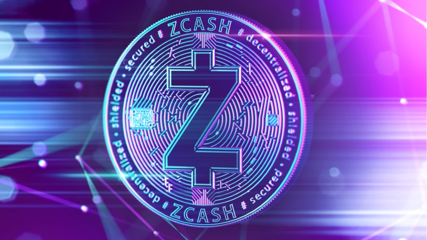
Zcash may seem like a carbon copy of Bitcoin at first. The color combination (black for the dollar-like “Z” and the circle frame and the gold background within) is also pretty much the same. However, if you dismantle the Z inside the coin-like symbol, you get the word “cash”. Try it.
Making remarkable cryptocurrency logos is undoubtedly not easy. Ergo, take the logos above as the inspiration.
No Comment